
The Importance Of A Logo For Your Business.
It is surprising how many new businesses start up without considering a logo or brand. A lack of budget or time is often used as an excuse, but it is a trick missed by many.
What is creating a logo, and why is it so important?
So, what does it take to build a brand that people remember? This article will cover the topic of your brand, which is a critically vital one. Your brand is the visual representation of your company, and it is the first thing a customer sees when they visit your website, shop, or physical store. Branding is crucial, and while developing a logo, you should take the necessary time and care to ensure that it is done correctly. When creating a distinctive logo and brand, many considerations should be considered. It will help if you keep several variables in mind while deciding on the most pleasing logo for your company. In this article, we’ll go over the best path to take when building a killer logo and brand, as well as some crucial aspects to consider when deciding on the ideal logo for your specific needs and requirements. Whether it’s the color, the typeface, or the icon, everything matters. Take your time while creating your logo, as it will be marketing your products and services for many years to come. It shouldn’t take you five minutes to build a logo that will be remembered forever. Once your logo and branding have been established as your company’s visual connection, it will be difficult, if not impossible, to change them in the future. If you keep this in mind, it will be easier to choose an attractive, easily legible, and timeless design for your logo. So let’s start with an explanation of the process of developing a brand that can propel you and your company to the next level of success.
Create a logo that makes an excellent first impression

3So; what is the purpose of developing a recognizable brand logo, and why is it so important? Humans do evaluate a book by its cover when it comes to visual perception, and we are naturally curious creatures. Whether it’s the box of the latest toy when you were a kid or looking for someone to take on a hot date when you’re in your twenties, the initial trigger is always something visually appealing. When it comes to building a brand, the same rules apply. The most effective technique to engage a potential consumer is to devise an appealing strategy. A logo is a marketing tool that should immediately draw the viewer’s attention. Your logo’s design will be determined by the products you are marketing. Each industry will have more appropriate colors and a style that will be more appropriate for your particular sector or industry. For example, you would not design a logo for a children’s nursery the same way you would create a restaurant chain.
First impressions are crucial.
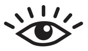 How does one develop a logo, and hence a visual identity? There is much more to a logo than just a text tag and a visually appealing icon. Is there a logo you’ve seen and had a strong attraction to it right away? What happens when we glance at a logo for the first time is something like this. When we see a logo for the first time, the receptors in our eyes convey information to our brain, which analyses the logo’s appearance and feel. This recognition takes place in a fraction of a second, and your brain registers an emotional response to what it perceives almost immediately afterward. Depending on the reaction, feelings of happiness, warmth, caring, or anxiety may be experienced by the person receiving the response.
icon of the eye
When we look at a brand, our eyes develop an emotional response.
The way we feel results from our brain’s response to external inputs. The process through which we design a logo reveals more about a company than we realize. Our brain is a beautiful and strong structure, yet we only utilize 10% of its potential. Because the human brain is the most sophisticated structure known in the known universe, it serves as our internal supercomputer, which has evolved over millions of years of evolution. It takes a lot of energy to keep the human brain running, with each day consuming 300 calories and producing enough electricity to power a low-wattage light bulb. Our brains are lightning-fast, with waves of electricity racing through our bodies at the speed of light to reach our neurons. Our eyes send signals to our brains that are practically instantaneous in their response time to induce a reply. Because of our ability to react quickly, humans have been able to survive and avoid danger throughout history. Instantaneously after the eye is exposed to light from an image, the process of decoding the visual begins in earnest. That is, all that happens in less than a blink of an eye is remarkable, as is the speed with which it occurs.
Response to forms, colors, and typefaces on the visual level
It is critical to understand how our brain and eyes work together to elicit an emotional response from us when we see a logo. Our senses assist us in navigating the world of emotion, and what we see will reflect how we are feeling at the time. Red, yellow, and orange evoke sensations of warmth and comfort, whereas tones of blue evoke feelings of chilly, calm, and non-threatening, respectively. Different emotions are elicited in the audience by different lettering styles. When using a serif font, you can convey a sense of quality and respectability, whereas rounded typefaces can get a sense of playfulness and lightheartedness. Typography in the script style, on the other hand, evokes sentiments of elegance and femininity in the reader. Different forms will elicit a variety of emotional responses from the viewer. Squares represent solidity, but circles evoke a sense of wholeness and harmony in the viewer. As we run with our faces slightly forward, we identify diagonal lines with action or movement, and with a horizontal line, we establish a connection to the horizon. On the other hand, a vertical line could evoke a sense of structure, as trees and buildings stand tall and straight in the landscape. Depending on how it is used, a semi-circle can represent the vision of a grin, grief, a rainbow, or sunrise in different ways.
Create a visually appealing logo
The first time a new customer sees your brand, they should be able to look away and sketch a rough blueprint of what they have just seen.
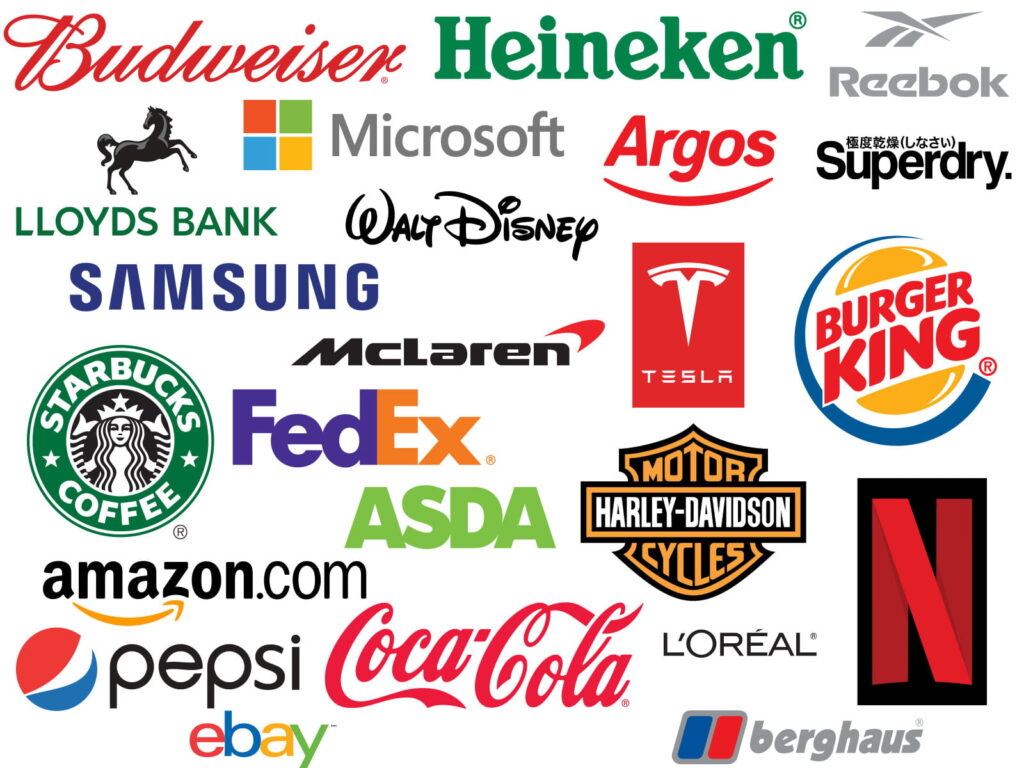
The most effective logos are those that catch the viewer’s attention immediately and elicit curiosity. To generate interest in what you are selling, logos should encourage people to look further into the brand or product. When you think of iconic logos, only a tiny number link to the product in the name or logo. You might be thinking, “Wait a minute, that’s not correct,” and indeed, some logos do have a link, such as Pets at Home, Carpet World, and so on. The majority of the major players’ logos don’t offer you any indication of what they are selling. It’s incredible to think that if you’d never seen some of the world’s most recognizable logos before, you’d be completely unaware of what that company was selling. Listed below is a list of firms whose logos do not appear associated with any particular product or service.
![]()
Recognition
What makes this so intriguing is that we instantly recognize big-name companies when we see them. When you see the Apple emblem, your brain immediately connects the dots, which indicates that a good logo should be memorable and easy to remember. Because most businesses begin with a bit of budget before establishing a well-known icon or logo that is instantly recognizable, it is critical to consider including an explanation of what you are providing. In the case of Apple, the company began as Apple Computers Inc., which explains the product. Over time, they have grown to become one of the world’s largest corporations, now known as Apple. Apple has grown to such a large scale that it no longer have to explain its goods.
You never know when you might be establishing the next Amazon or McDonald’s, so keep in mind how your logo might evolve in the future when developing your brand.
Create a brand that will last a lifetime
There is more to developing a timeless brand than what catches the eye at first glance. It is common for large, well-known corporations to rebrand from time to time. But the modifications are minor, resulting in a logo that retains a strong resemblance to the original even in its facelifted form. It is critical to maintaining a solid link with the prior brand, and it is necessary to demonstrate this relationship clearly to avoid confusing returning customers. You should select a logo that has the potential to evolve. When choosing a logo and brand, consider how you will modify your logo in the future to maintain it looking current and relevant. Evolutionary history of the famous Coca-Cola logo, showing how it has changed over time to become the logo you see today.
![]()
The fundamentals of designing a logo
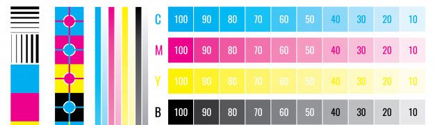
You and your firm can be identified by your logo, which helps both new and returning customers recognize you. Within two seconds, your logo must capture the viewer’s attention and be instantly recognizable by them. How you choose your perfect logo or brand will be determined by the nature of your business, as well as the service or product you are selling. Your logo should be simple to read and simple to comprehend and pronounce. The importance of simplicity cannot be overstated. If you want to use a symbol to go along with your logo, be sure to keep it simple and easy to notice as well. One other crucial factor to consider is how your brand will be printed. For CMYK to work well, you must utilize colors that can be easily copied.
Colors
Earlier, we mentioned how important it is to choose colors representing your product and services. The selection of a color scheme is critical to the success of any design project. Even in the realm of color, less is more, as evidenced by the fact that many iconic logos use only one or two colors on most occasions. You automatically think of their multicolored logo when you think of eBay, despite their logo being simply four colors.
Okay, so you’ve selected an eye-catching color scheme, but how does it do in the real world? Because CMYK is the industry-standard print color process, your logo must appear excellent when printed in typical CMYK colors to be successful. Employing a designer will ensure that your logo is easy to read and seems brilliant in CMYK color mode. In the case of a file created initially in RGB (screen colors), the colors can appear dull and washed out when converted to CMYK. When maintaining color constancy, using a Pantone color is a fantastic option. Pantone is a well-known color matching technique that allows print companies to match colors from a physical color chart booklet in the printing industry. Once again, when selecting a Pantone color, ensure that the color reproduces adequately in CMYK format. If you are unsure, consult with a local print shop for guidance. It is also essential to examine how your logo will appear, whether displayed on a car livery, a printed PVC banner, a display, or a printed Gazebo, among other things.
Vibrancy
A brand’s identity and logo should be eye-catching and entertaining. Bright, eye-catching colors are always well-received, and they are utilized more frequently than softer, paler versions of the same color. A sense of movement and vitality will be created by using colorful and bright colors. There are only a handful of well-known logos designed in color brown for apparent reasons. It should be noted that there are several exceptions to the rule, with coffee shops and chocolate firms being the most popular. When designing a full of energy and life logo, it is crucial to incorporate vibrancy into the design. Even if you prefer softer, less brilliant colors, you may still develop a dynamic brand from a design standpoint.
Proportions of the Logo
The proportions of your logo are pretty significant and should be carefully considered during the design process. You don’t want a logo that is too deep in height or too long and thin at the same time. Examine the logos of other well-known companies to obtain a sense of the logo’s proportions. Choosing a logo with well-balanced proportions will make it much easier at a later point when ordering products such as printed banners or producing a design for car livery since the logo will fit better in the available space.
The scale of a logo
When designing a logo, it is also vital to consider the sizing of the logo. When developing or hiring a designer, make sure to build a logo that can be scaled to fit any size space available on the screen. It is highly recommended that you create your logo in vector format since this will allow you to scale it to any size without distortion. It is common for web designers to develop logos using pixel-based applications like photoshop; nevertheless, this should be avoided at all costs. If a designer instructs you that this is correct, you should seek another designer. Alternatively, you can read this article on the advantages of utilizing vector graphics for additional information on vectors:
Consistency is essential
Consistency is essential in maintaining the integrity of your brand. It is usually a good idea to create a simple brand guideline library that shows your logo in various settings. A brand guideline is a series of visual signals indicating how your logo should be displayed on numerous marketing platforms. It is a valuable tool for keeping your branding home in order. You can include a page that shows your chosen colors and Pantone references. It should have a section displaying your logos and emblems. It is not uncommon for a logo to be available in various variations, such as two or more variations. It is possible to place the symbol above the phrase. Another option would be to put the emblem to the words’ left. Always keep in mind to create a monochrome form of the logos that are either black and white or greyscale in appearance. When it comes to adding to corporate documents, contracts, and terms and conditions, a simple black and white version can be helpful. When developing brand standards, it’s a good idea to include a section on what to do and what not to do in your branding guidelines. Use a checkmark to indicate proper use of a logo and a red X to indicate improper use of a logo. The usage of correct and wrong examples demonstrates how your logo should be used. By including precise directions in your guidelines, you can ensure that future subcontractors who create artwork on your behalf have unambiguous instructions on how to represent your company’s brand.
Getting started with the process of developing a recognizable brand
After reading this blog, you should be well on your way to understanding what you need to consider before beginning the process of creating a logo for your company. Rather than writing from a designer’s perspective, this piece is intended to provide knowledge to those looking to establish a successful and recognizable brand identity for their company. Hopefully, by now, you will be seeking the services of a graphic designer, and you will have a better understanding of what it takes to create an easily recognizable brand.
Dealing with a Graphic Designer can be difficult.
A graphic designer will likely have a distinct style that distinguishes them from others. If you disagree with their recommended design, it’s not uncommon for them to try to persuade you to change your mind and accept their recommendations instead. Should you put your faith in the advice of your graphic designer? However, from experience, I follow my gut instincts and, if the proposal does not meet my standards, I will take the time to express my issues and request a different design altogether.
Why do graphic designers attempt to influence your decision? In the first place, it’s an effortless day at the office, and the sooner a designer can get you to sign off, the more money they make. Second, developing logo concepts takes a significant amount of time; thus, they may be short on time. Finally, they have created a design that is unique to them. It’s always a matter of opinion when it comes to design because your designer has interpreted your brief in a specific way and has an emotional attachment to their creation.
Everything revolves around communication.
You should clarify your issues and provide feedback or suggestions to help the designer improve the design if you do not like it. You can even modify the brief to reach a compromise, or you can throw it away and start over. The use of phrases such as ‘I’m not feeling it, or ‘Can you jazz it up just a bit.’ or, even worse, ‘I don’t know what I want,’ and lastly, “You’re the expert” while providing input to your designer is not recommended. Keep in mind that a designer is a specialist in creating designs but not an expert in your particular field. You, and not the designer, are in charge of all knowledge and direction regarding how it should look and read in the final product. You have the right to be critical, but you must also be constructive at the same time. You will not build your perfect logo until you receive constructive feedback and guidance.
Why Is A Logo So Important For Your Business?
![]() An effective logo helps customers and prospects instantly identify your brand. It should be used across various media such as your Website, Emails, Letterheads, Business Cards, Flyers, Adverts, Clothing, and Signage.
An effective logo helps customers and prospects instantly identify your brand. It should be used across various media such as your Website, Emails, Letterheads, Business Cards, Flyers, Adverts, Clothing, and Signage.
Correctly branded, your business will instantly come across as more professional than your competitors. This in itself helps to attract more inquiries and more business. Imagine spotting a plain white van parked outside a neighbor’s house one day. You have no idea who the van belongs to or what service they might be providing. However, if the truck is branded up with a Plumbing Company logo and contact details, you won’t be left confused.
A logo and simple branding are vital even for a one-man-band local tradesman.


No responses yet